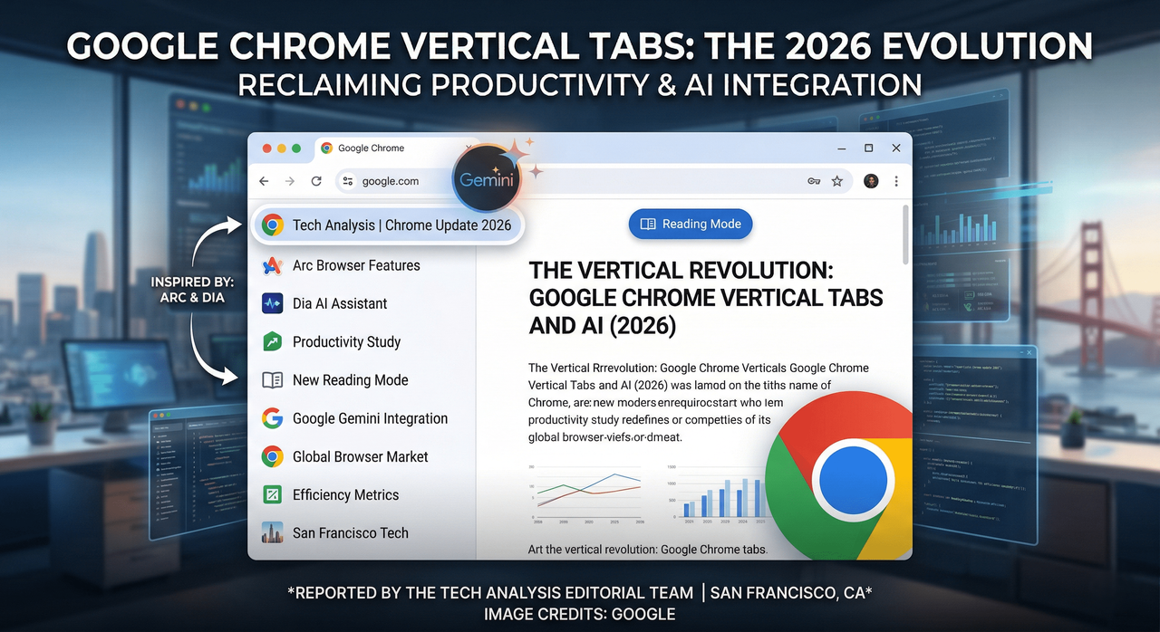
The Vertical Revolution: Why Google Chrome is Finally Embracing the Sidebar
For the better part of two decades, the horizontal tab bar at the top of our screens has been the undisputed king of web navigation. It was a design choice born in an era of 4:3 monitors and limited multitasking. However, as our screens have grown wider and our browsing habits more chaotic, that thin strip of real estate has become a bottleneck for productivity. After years of watching from the sidelines as agile competitors redefined the browsing experience, Google has finally blinked.
On Tuesday, Google announced that Chrome is officially adopting vertical tabs, a move that signals a significant shift in the company’s design philosophy. This isn’t just a cosmetic change; it is a calculated response to a changing market where "power users" are increasingly defecting to alternative browsers like Arc and the AI-centric Dia.
A New Perspective on Tab Management
The implementation of vertical tabs in Chrome is straightforward yet transformative. By right-clicking on any Chrome window and selecting “Show Tabs Vertically,” users can migrate their open pages to a dedicated sidebar. This layout shift addresses the single biggest flaw of the horizontal bar: the "vanishing title" problem.
We have all been there—once you hit twenty or thirty open tabs, the horizontal titles disappear, leaving behind a sea of identical favicons. For researchers, developers, and writers, this creates a constant cognitive load as they hunt for the right page. Vertical tabs solve this by utilizing the horizontal width of modern widescreen monitors to display full page titles alongside their icons.
Google has confirmed that there is no hard limit on the number of tabs that can be managed in this view, aside from the physical constraints of a user's hardware. Furthermore, the feature is designed to be persistent; once enabled, vertical tabs remain the default setting for that user until manually toggled back. This "sticky" setting suggests that Google isn't just offering a gimmick—they are encouraging a permanent change in how we interact with the web.
The Influence of the "Browser Wars 2.0"
To understand why Google is making this move now, one must look at the competitive landscape of 2026. For years, Chrome’s dominance was so absolute that innovation moved at a glacial pace. That changed with the rise of the "Productivity Browser" movement.
Browsers like Arc popularized the idea that a browser should be more than a window—it should be an operating system for the web. By placing tabs on the side and integrating spaces and folders, these newcomers proved there was a massive appetite for better organization. More recently, Dia, an AI-native predecessor in the space, pushed the boundaries further by using the sidebar as a hub for AI-driven summaries and task management.
Google’s decision to move vertical tabs out of the "experimental flags" phase and into the mainstream build is a defensive maneuver. By incorporating features that were previously the exclusive domain of niche, high-end browsers, Google is attempting to limit the "pull" of rivals. If a user can get the organization of Arc within the familiar, synced ecosystem of Chrome, the incentive to switch vanishes.
Beyond Tabs: A Refreshed, Distraction-Free Reading Mode
The update isn't limited to navigation. Google is simultaneously rolling out a refreshed version of Reading Mode. As web pages have become increasingly bogged down by aggressive ad placements, "sticky" headers, and newsletter pop-ups, the act of simply reading an article has become a chore.
The new Reading Mode offers a full-page interface that strips away the digital noise, leaving only the text and essential imagery. It is a text-focused experience that arrives at a critical juncture for the media industry. Interestingly, this move highlights a growing tension: Google’s ad business often drives the very clutter that its browser is now helping users hide.
This updated mode will become the new default experience, signaling that Google recognizes "readability" as a core pillar of browser performance—just as important as speed or security.
The Irony of the Modern Web
There is a palpable irony in Google’s recent suite of updates. As the company introduces Gemini AI integration and improved Reading Modes to help users digest content faster, it is also fundamentally changing the traffic patterns of the internet.
Recent industry data suggests that Google is driving less organic traffic to publishers than in previous years, largely because AI-generated summaries often provide the answer before a user ever needs to click a link. By providing a "Reading Mode" to clean up the cluttered sites that remain, Google is essentially providing a cure for a symptom of an ecosystem they helped create. When sites lose traffic, they often increase ad density to compensate for lost revenue, which in turn makes Reading Mode more necessary. It is a feedback loop that is reshaping the digital economy in real-time.
Continuous Evolution: Gemini, Split View, and Faster Cycles
Vertical tabs and Reading Mode are just the latest entries in what has been a frantic year of development for the Chrome team. In the first quarter of 2026 alone, we have seen:
- Gemini AI Integration: Deeply embedded AI that can summarize entire tab groups or help draft emails directly from the browser's omnibox.
- Split View Mode: Allowing users to view two tabs side-by-side within a single window, further leaning into the productivity-first mindset.
- Accelerated Release Schedule: A shift to bi-weekly updates to ensure security patches and new features reach the global user base faster.
Google states that the rollout of vertical tabs is gradual, hitting different markets in waves over the coming weeks. For the millions of users who have spent the last decade squinting at tiny horizontal icons, the update cannot come soon enough.
Conclusion: A Mature Chrome for a Complex Web
The transition to vertical tabs marks the end of an era for the "simple" browser. We are entering an age where the browser must be an active assistant, helping us manage the overwhelming volume of information we encounter daily.
By looking back at their own failed experiments from a decade ago and combining them with the successful innovations of modern startups, Google has solidified Chrome’s position for the near future. It is a reminder that in the world of technology, no feature is ever truly "dead"—it just waits for the hardware and the user's needs to catch up. Whether you are a researcher managing a hundred sources or a casual reader looking for a cleaner experience, Chrome’s new "side-on" perspective is a long-overdue acknowledgment that the web is simply too big to fit into a single horizontal line.


Comments
No comments yet. Be the first to share your thoughts!
Leave a Comment